Matplotlib intro (pyplot)
A very simple introduction to Matplotlib in Python. It tries to present fundamental concepts without clinging to many details. If you have time I highly recommend you another post which is much more conceptual, detailed and illustrated than mine: “Artist” in matplotlib.
import matplotlib.pyplot as plt
Basics: Figures and Axes
The most important thing that you have to know is that Matplotlib has two main classes for plotting curves and setting up configurations: Figure and Axes. In this section we present these objects and its main methods.
Figure
The Figure object is a major object that contains all of the plot elements (including the Axes object, which we will see next). It can be accessed in the following manners:
fig = plt.figure() # returns a Figure instance
The last line is a shortcut for getting the current figure and its axes; see these answers for more details.
Configurations such as saving and displaying the figure are set at the figure-level:
fig.savefig('filepath.png') # saves figure
fig.show() # displays figure
Axes
Axes are the objects that have plotting methods. Each figure can contain multiple axes, thus allowing you to make multiple plots on the same figure. They are created and accessed from the figure object:
# create new axes
ax1 = fig.subplots() # add a set of subplots to this figure (default 1)

# get existing axes
axs = fig.axes # list of axes in `fig`
Once you have the axis object that you want to plot a curve into, the only thing you need to do is to call the plotting method:
ax1.plot(x, y)
There are many different kinds of plotting methods (which we will not cover), here are a few:
ax.plotLines and/or Markersax.barBars chartax.histHistogramplt.scatterScatter (has capability to render a different size and/or color for each point, in contrast to plot)
Shortcuts: the Pyplot interface
To make things easier, Matplotlib has shortcuts for the methods mentioned above directly through pyplot. That is, lots of methods can be called from pyplot, regardless of whether they would normally be called from a Figure or an Axis object:
import matplotlib.pyplot as plt

# Example 1
plt.plot([1,2,3])
plt.savefig('filepath.png')
plt.show()

# Example 2
fig, ax1 = plt.subplots() # get figure and 1 axes (already added to fig)
...
Axis labels, Legends, and Title
Legend, title and axis labels should be set in the axis object:
# TITLE AND AXIS LABELS
ax.set(title='title', xlabel='xlabel', ylabel='ylabel')
# or
ax.set_title('title')
ax.set_xlabel('xlabel')
ax.set_ylabel('ylabel')

# LEGEND
# add labels to curves
ax.plot(xa, ya, label='Algorithm A')
ax.plot(xb, yb, label='Algorithm B')

# call legend function
ax.legend()
Of course, Matplotlib has shortcuts for these methods directly through pyplot as well, in the case you are dealing with a single plot:
# shortcuts
plt.title('title')
plt.xlabel('xlabel')
plt.ylabel('ylabel')
plt.legend()
Subplots
In Matplotlib, the subplot functionality allows you to specify where the axes should be situated (in the figure) according to a subplot grid.
ax1 = fig.add_subplot(221) # creates an axis in the position specified (row-col-num)
ax2 = fig.add_subplot(222) # creates an axis in the position specified (row-col-num)
ax3 = fig.add_subplot(223) # creates an axis in the position specified (row-col-num)
ax4 = fig.add_subplot(224) # creates an axis in the position specified (row-col-num)
# or
[[ax1, ax2], [ax3, ax4]] = fig.subplots(nrows=2, ncols=2) # add a set of subplots to this figure
# or
fig, [[ax1, ax2], [ax3, ax4]] = plt.subplots(nrows=2, ncols=2) # shortcut for getting both figure and (all) axes
After getting the axes, you can call the plotting method of your choice for each one.
Breaking out of the grid
In addition, these functions do not impose a fixed grid, they simply create new axes that occupy specific positions. Because of that, you can create subplots with varying widths and heights in the same figure.
An option for a very flexible plotting scheme is the following: specify a starting position (x0,y0) and the size of your new axis (width,height) by passing the quadruple (x0,y0,width,height) to add_subplot via the position keyword argument:
ax1 = fig.add_subplot(position=(x0,y0,width,height))
Alternatively, you can use the add_axes method, whose calling signature is the same quadruple. Its differences to add_subplot method are well discussed here.
Decoration
Usually configuration of the curves, bars, histograms, etc. are done in the respective plotting function:
plt.plot(x, y, color='green', marker='o', linestyle='dashed',
         linewidth=2, markersize=12)
Check out the docs for more details:
Specific tips
- The parameter
alphais usually the transparency of the curve. - Use
plt.tight_layout()when your subplots have titles
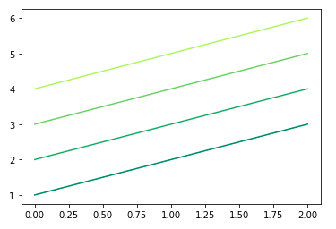
Varying colors w/ custom colormap
Say you want to plot a set of lines with their colors varying according to some criteria.
Matplotlib define a set of colormaps via matplotlib.cm, that returns a color from the colormap given your input (which can be in the range [0,1] or [0, 255]):
import matplotlib.pyplot as plt
from matplotlib import cm

ys = ([1,2,3], [2,3,4], [3,4,5], [4,5,6])

for i,y in enumerate(ys):
    plt.plot(y, color=cm.summer(i/len(ys)))
Other resources
Examples
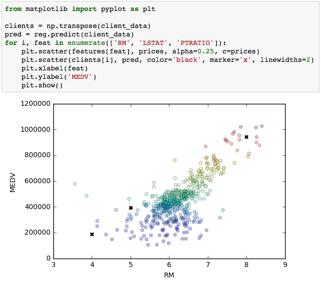
Highlighting specific data points in a scatter plot
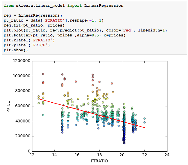
Color warmth in scatter plot
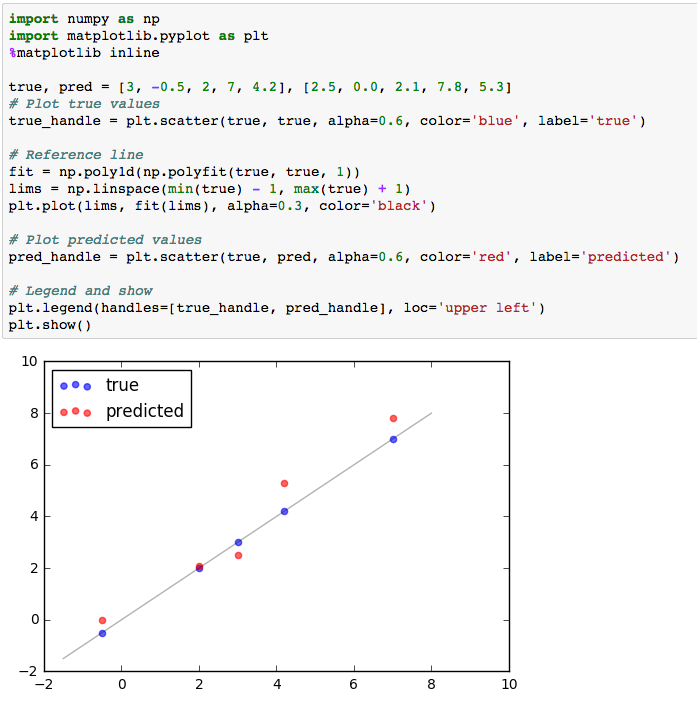
True vs predicted data points